... it really bothers me to hear newscasters refer to the president as Mr. Obama. I never, never hear Mr. Bush. Maybe I'm excessively race-conscious, but one explanation for the weird trend occurs to me immediately.
My irritation has, however, been funneled into something useful: Lots of fresh items in the shop! Click the link in the description at top right to see them all.
Monday, February 28, 2011
Friday, February 25, 2011
Meditation upon Chandeliers
Surely someone must wear chandelier earrings these days. Right?
Chandelier earrings have seemed since I started my Etsy shop to just be not worth the effort. They consistently get lower views than similarly tagged earrings in other styles, I've never sold a pair, and they are actually harder and more repetitive to make than even many-tiered drops.
Available here.
The wholesaler I use is having a sale on a bunch of Swarovski stuff and I ordered some of their silver-plated pewter findings, but found myself hesitating over the chandelier findings. "Chelsea," I said to myself, "these are the best deal they have. Chandelier plus post plus clutch. If you're trying to get the most for your money this is what you should be doing."
Then I said to myself, "But it's foolish to throw good money after bad getting things that won't sell. And the likelihood of someone requesting a pair of chandelier earrings, let alone a single pair in the specific color you're getting, is apparently slim."
Then I said to myself, "I need to stop talking to myself. It alarms Megan if I do it too often or earnestly."
So really, which is worse? Passing up a pretty good opportunity to get discount supplies -- or getting supplies that I know are slow sellers?
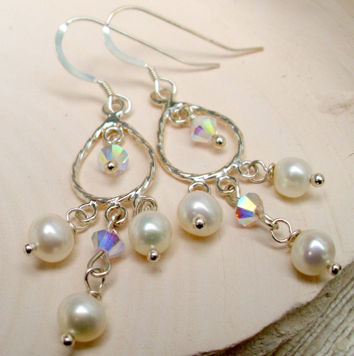
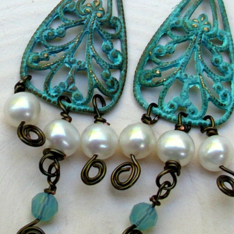
The pair above was for the wedding collection, mind you, and wedding jewelry sort of across the board seems to be largely the same stuff so I felt obligated to have some "classic" boring pieces. I don't think they're especially boring, though, and I'm really proud of the photo, where the slightly darker clay sets off the rainbow effect of the AB crystal quite well for this neat sort of carnival effect. Still, they were meant as a complement, not a showpiece. This pair was more intended for actual, y'know, coolness, sort of a Steampunk Atlantean feel:
Available here.
Possibly the slow selling is because people are highly aware that anonymous chandelier earrings are a staple of the cheap import fashion jewelry market and the look can be gotten for a lot less -- for which I can't blame people at all. It's a little ludicrous to try to compete with dollar-a-pair outfits at their own game, and the look has to be significantly different for jewelry to not be a futile market. The look has to be different (unexpected bead and finding choices); the quality has to be higher (I wire-wrap the elements together, because that's a whole lot of a small, fine-gauge jump rings to put so much trust in and wire-wrapping is much more secure).
I did take the trouble to list another set this week, because I've had these forty-year-old curtain rings in my hardware box for ages, then found that it is remarkable how much grey transparent glass will take on the tones of the metal it's nearest:
Available here.
Still, ones like the second photo seem like they ought to be going better than they do ... which leads me back to my original question. Is it just that I'm the only one who wears chandelier earrings anymore?
Chandelier earrings have seemed since I started my Etsy shop to just be not worth the effort. They consistently get lower views than similarly tagged earrings in other styles, I've never sold a pair, and they are actually harder and more repetitive to make than even many-tiered drops.
Available here.
The wholesaler I use is having a sale on a bunch of Swarovski stuff and I ordered some of their silver-plated pewter findings, but found myself hesitating over the chandelier findings. "Chelsea," I said to myself, "these are the best deal they have. Chandelier plus post plus clutch. If you're trying to get the most for your money this is what you should be doing."
Then I said to myself, "But it's foolish to throw good money after bad getting things that won't sell. And the likelihood of someone requesting a pair of chandelier earrings, let alone a single pair in the specific color you're getting, is apparently slim."
Then I said to myself, "I need to stop talking to myself. It alarms Megan if I do it too often or earnestly."
So really, which is worse? Passing up a pretty good opportunity to get discount supplies -- or getting supplies that I know are slow sellers?
The pair above was for the wedding collection, mind you, and wedding jewelry sort of across the board seems to be largely the same stuff so I felt obligated to have some "classic" boring pieces. I don't think they're especially boring, though, and I'm really proud of the photo, where the slightly darker clay sets off the rainbow effect of the AB crystal quite well for this neat sort of carnival effect. Still, they were meant as a complement, not a showpiece. This pair was more intended for actual, y'know, coolness, sort of a Steampunk Atlantean feel:
Available here.
Possibly the slow selling is because people are highly aware that anonymous chandelier earrings are a staple of the cheap import fashion jewelry market and the look can be gotten for a lot less -- for which I can't blame people at all. It's a little ludicrous to try to compete with dollar-a-pair outfits at their own game, and the look has to be significantly different for jewelry to not be a futile market. The look has to be different (unexpected bead and finding choices); the quality has to be higher (I wire-wrap the elements together, because that's a whole lot of a small, fine-gauge jump rings to put so much trust in and wire-wrapping is much more secure).
I did take the trouble to list another set this week, because I've had these forty-year-old curtain rings in my hardware box for ages, then found that it is remarkable how much grey transparent glass will take on the tones of the metal it's nearest:
Available here.
Still, ones like the second photo seem like they ought to be going better than they do ... which leads me back to my original question. Is it just that I'm the only one who wears chandelier earrings anymore?
Wednesday, February 23, 2011
The "creative spirit" and the right to be moody
Every few days, I realize again what a small and colorless thing my life was in those three months devoid of both beading and Megan.
I tend to be slightly annoyed with myself upon this realization (once I get done being pathetically grateful to the people who made it possible for that period to be only one quarter year long) because it bothers me when people talk loftily about how creation makes their soul take wing and they only know peace when making things. I am not that sort of person. As an illustration, I spent the last few days teaching myself to use GIMP for absolutely no utility by making a set of classic emo-kid Lord of the Rings Livejournal icons with Abney Park lyrics -- in, naturally, an ironic and self-aware manner. For those hours of fighting with the text-layer editor, I knew creative peace, and there was absolutely nothing lofty or meaningful about it.
(Conclusion: Among free programs, Picasa really is your best bet for the basics of organizing and screwing around with the highlights. Also for adding text on non-busy backgrounds, but don't think you're getting drop shadows or anything special. Strictly business. GIMP is great fun but better for arty noodling around than businesslike photography. Though it made great banners and icons ... more on this later.)
Anyhow.
The problem with that whole Creative Spirit attitude is that it eliminates the right to be in a bad mood. You're left feeling guilty about your work: "I shouldn't bead! I'm angry! Hypnotically soothing as it is to slip the wire through the little holes again and again and again, I mustn't, because all the people who look and sound like Artists say that the best work comes when you are in a spiritually nurtured, well-organized physical and mental space."
Maybe I'd be a more successful designer if I could talk myself into the colorfully Inspired mood, but I can't. I don't. I am a person who screws around on the Internet for hours on end and beads when I'm depressed, except when I can't, and loves demotivational posters to distraction. Sometimes it's not a matter of Being An Art Jewelry Designer. Sometimes it's a matter of picking some stuff that looks nice together and beading until you're relaxed -- and maybe if you've got a pretty good eye for stuff that goes together the resulting stuff is pretty and saleable stuff.
Coming soon: a collection of my favorite wincingly bad story-jewelry sayings.
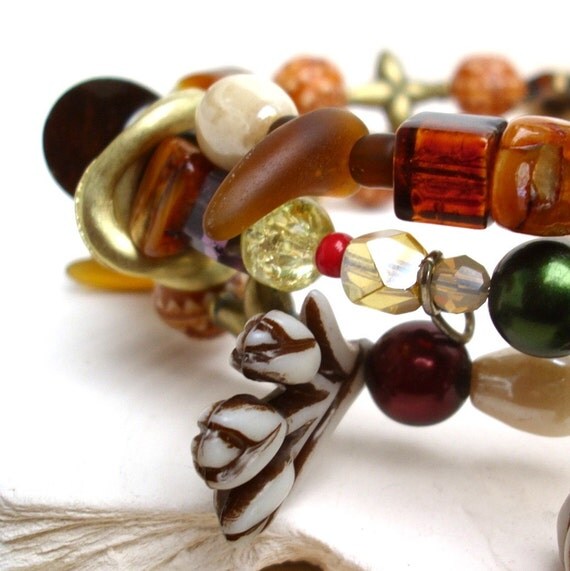
Have an unrelated picture of a memory bracelet!
Available here.
I tend to be slightly annoyed with myself upon this realization (once I get done being pathetically grateful to the people who made it possible for that period to be only one quarter year long) because it bothers me when people talk loftily about how creation makes their soul take wing and they only know peace when making things. I am not that sort of person. As an illustration, I spent the last few days teaching myself to use GIMP for absolutely no utility by making a set of classic emo-kid Lord of the Rings Livejournal icons with Abney Park lyrics -- in, naturally, an ironic and self-aware manner. For those hours of fighting with the text-layer editor, I knew creative peace, and there was absolutely nothing lofty or meaningful about it.
(Conclusion: Among free programs, Picasa really is your best bet for the basics of organizing and screwing around with the highlights. Also for adding text on non-busy backgrounds, but don't think you're getting drop shadows or anything special. Strictly business. GIMP is great fun but better for arty noodling around than businesslike photography. Though it made great banners and icons ... more on this later.)
Anyhow.
The problem with that whole Creative Spirit attitude is that it eliminates the right to be in a bad mood. You're left feeling guilty about your work: "I shouldn't bead! I'm angry! Hypnotically soothing as it is to slip the wire through the little holes again and again and again, I mustn't, because all the people who look and sound like Artists say that the best work comes when you are in a spiritually nurtured, well-organized physical and mental space."
Maybe I'd be a more successful designer if I could talk myself into the colorfully Inspired mood, but I can't. I don't. I am a person who screws around on the Internet for hours on end and beads when I'm depressed, except when I can't, and loves demotivational posters to distraction. Sometimes it's not a matter of Being An Art Jewelry Designer. Sometimes it's a matter of picking some stuff that looks nice together and beading until you're relaxed -- and maybe if you've got a pretty good eye for stuff that goes together the resulting stuff is pretty and saleable stuff.
Coming soon: a collection of my favorite wincingly bad story-jewelry sayings.
Have an unrelated picture of a memory bracelet!
Available here.
Monday, February 21, 2011
Fabric pearls through the ages
This is my fact for the day. Not something you often think about ... fabric imitations of pearls. It's an interesting little fashion meme through history.
These are Japanese cotton pearls, from this NOS Etsy seller, whose prices are remarkably okay:
Photo copyright J.A. Hershberger.
Cotton pearls were made in the 1920s and are literally made of very tightly wound cotton thread with a nacre coating.
During the Victorian age, the finest evening toilettes might be accented with chenille balls, embroidered onto the fabric or strung in imitation of ropes of pearls:

Image from an 1870's Harper's Bazar, reproduced in Stella Blum's awesome book of plates.
All the round beading you see is chenille. The effect was often quite luxurious and medieval-looking.
This does mean that soft fuzzy balls are perfectly acceptable for steampunk designs, historically speaking. Hm.
So that would be today's unusual historical fashion thingy, for no better reason than that I've been thinking about imitation pearls what with the Swarovski I'm working with of late ... I like how they feel! The weight of pearls is really hard to mimic, but those are heavy and weighty and rich running through your hands. This is why I always let people pick up my jewelry at shows all they like: I like my jewelry heavy, with the sole exception of earrings. It makes me perceive it as more valuable. Is this uncommon?
These are Japanese cotton pearls, from this NOS Etsy seller, whose prices are remarkably okay:
Photo copyright J.A. Hershberger.
Cotton pearls were made in the 1920s and are literally made of very tightly wound cotton thread with a nacre coating.
During the Victorian age, the finest evening toilettes might be accented with chenille balls, embroidered onto the fabric or strung in imitation of ropes of pearls:
Image from an 1870's Harper's Bazar, reproduced in Stella Blum's awesome book of plates.
All the round beading you see is chenille. The effect was often quite luxurious and medieval-looking.
This does mean that soft fuzzy balls are perfectly acceptable for steampunk designs, historically speaking. Hm.
So that would be today's unusual historical fashion thingy, for no better reason than that I've been thinking about imitation pearls what with the Swarovski I'm working with of late ... I like how they feel! The weight of pearls is really hard to mimic, but those are heavy and weighty and rich running through your hands. This is why I always let people pick up my jewelry at shows all they like: I like my jewelry heavy, with the sole exception of earrings. It makes me perceive it as more valuable. Is this uncommon?
Friday, February 18, 2011
This is how I felt the entirety of last fall

It's funny because it's true, people. It's funny because it's true.
Wednesday, February 16, 2011
Reflecting on evangelism
Today, someone tried to either pick me up or save my soul, and I'm not entirely sure which. M votes "both."
After I finish work, if I'm not in the mood to truck into Clemson, I walk behind the writing center of the technical college where I tutor and read. Friday, I had forgotten after I showered and didn't have my ring on. This will become significant.
I was sitting alone on a brick wall over a little amphitheatre, rereading The Return of the King (the first authorized American edition, which I sadly can't find a photo of, but it has this incredibly surreal stoneresque cover art that Papa Tolkien haaated) and looking out into the forest behind the school, when a cute curly-haired boy about my age (21) walked over and struck up a conversation which started out as an idle chitchat ("How are you doing? I'm hearing we're supposed to get another snowstorm. Do they have music down there ever?"), and then turned into clear disappointment when I mentioned that I worked there (because it was easier than "please stop hitting on me, I'm sort of engaged -- to a girl"), then we talked about the writing center and he made as if to leave and then remember something --
-- and dug out a flier for the Campus Crusade for Christ.
I have an ethical objection to evangelism. I think it speaks of overweening pride, which last I checked was one of the Seven Deadly Sins, so logically if you believe in sin you really shouldn't be loud about it. However, I realize that everyday missionary efforts (we called it "witnessing" when I was a churchy type) are hard and thankless work; they take a lot of courage and a lot of social navigation; and regardless of how I regard the idea of pressing your beliefs on others because you are so utterly convinced you're right, they are often (not always) undertaken with a view to the betterment of mankind.
Consequently, throughout my undergraduate, I had a personal rule that if I didn't have anywhere to be in a hurry, I'd stop and talk to the political and religious folk who hailed me. I made some friends this way -- our Hare Krishna monk, Avidar, was a really nice guy -- and I learned a little -- I now refuse to eat pate -- and on two occasions I told people very coldly what I thought of them and their cruel, pessimistic form of Christianity and kept going, but much of the time, people were kind and smiling and, most importantly, seemed cheered by having had someone talk to them in a polite, friendly and open manner, or smile and thank them for whatever they were passing out. This made me feel better about myself and often put a better spin on a long day.
Due to this policy, when I moved, I had a shelf containing two Books of Mormon, a Bhagavad-Gita, two PETA pamphlets, a handbook of Buddhist principles, several copies of The Watchtower, and four different colors of the little Psalms-Proverbs-New-Testaments that the Gideon Society hands out. I confess that I paired them up oddly in the hopes they'd get into fights.
So what to make of this encounter? I'm not sure why it troubles me so much, except of course for the little voice in the back of my head that always says You are vain and self-deluded for thinking that he could really have actually been interested, a voice which I struggle against daily and which I am mostly overcoming ... mostly. But then, this is a topic that often bothers me a little too much; I remember being one of those shallow evangelical types who was taught to be supercilious about rejecting everything that did not perfectly align with the worldview of my (less-than-highly-educated and, in some cases, questionably-interested-in-working-with-teens) adult mentors, and, like the former cult member I sort of am, that type of person frightens and disturbs me greatly.
This boy wasn't like that, though, or not that I could see, and it's possible that he genuinely did just come over to talk and then remember he was supposed to pass around fliers. And I wish I could get over this mistrust and just be flattered that this shyish-seeming person considered me worth making a clear effort to come and talk to.
And also, I possibly need to not forget my engagement ring anymore so I'm not sent into an unhealthy level of self-reflection. So it is resolved!
Monday, February 14, 2011
I feel vaguely obligated to do a Valentine's day post ...
... but I remember being single and how much Valentine's Day always depressed me, since I inevitably broke up with my boyfriends before it and I was never a particularly sociable teenager, preferring the company of adults and butterflying from one social group to another, which was lonely but relatively drama-free.
Yet Valentine's Day is a big jewelry occasion. So it relates.
Kind of.
Let me see if I have a single picture of jewelry with a heart on it to post ...
Nope! I had something at Christmas, but it's very Christmassy. Well, who cares.
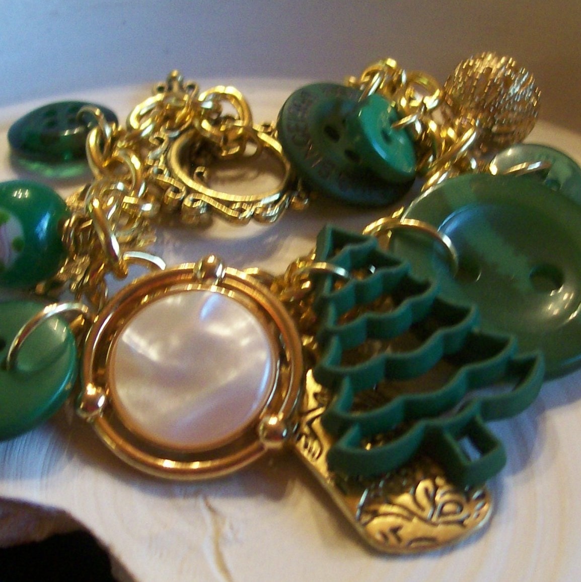
See? That button at the very back is heart-shaped. No, I promise.
I wonder what went so wrong in taking this photo ... I might have tried to take it indoors. That's never good.
Last Valentine's day, Megan and I went to the Living Desert zoo so I could do fieldwork for one of my anthropology papers, "Conservation and the Narrative of Stewardship." Afterward, we lugged our sunburnt selves around Palm Desert for an hour trying to find a place with room not at the bar since I was not yet of drinking age, and not with $30 entrees and mandatory valet parking, and we wound up in a Coco's with all the other gay couples who live in the Palm Springs area, and we ordered a fruit-and-cheese appetizer platter but it was the first day it had been available so they didn't know how to cook it and it took three tries to get the Brie baked properly, so we were in the restaurant for well over two hours grazing on improperly cooked cheeses and talking about the White Man's Burden savior narrative and the conflation of the animal body with the exoticized body.
This is one of my best and most treasured "couple memories," and it involves no chocolates, no jewelry, no expensive tickets, no dressing up nicely, no Valentiney things at all.
Conclusion: I'm obviously really bad at this, and I'm okay with that.
Yet Valentine's Day is a big jewelry occasion. So it relates.
Kind of.
Let me see if I have a single picture of jewelry with a heart on it to post ...
Nope! I had something at Christmas, but it's very Christmassy. Well, who cares.
See? That button at the very back is heart-shaped. No, I promise.
I wonder what went so wrong in taking this photo ... I might have tried to take it indoors. That's never good.
Last Valentine's day, Megan and I went to the Living Desert zoo so I could do fieldwork for one of my anthropology papers, "Conservation and the Narrative of Stewardship." Afterward, we lugged our sunburnt selves around Palm Desert for an hour trying to find a place with room not at the bar since I was not yet of drinking age, and not with $30 entrees and mandatory valet parking, and we wound up in a Coco's with all the other gay couples who live in the Palm Springs area, and we ordered a fruit-and-cheese appetizer platter but it was the first day it had been available so they didn't know how to cook it and it took three tries to get the Brie baked properly, so we were in the restaurant for well over two hours grazing on improperly cooked cheeses and talking about the White Man's Burden savior narrative and the conflation of the animal body with the exoticized body.
This is one of my best and most treasured "couple memories," and it involves no chocolates, no jewelry, no expensive tickets, no dressing up nicely, no Valentiney things at all.
Conclusion: I'm obviously really bad at this, and I'm okay with that.
Friday, February 11, 2011
Shop reorganization
I've finally redone my shop sections, because I was starting to get irritated by some of them ("Feminine Touches"? Really, Chelsea? Could you possibly be less specific?).
So now the sections are "Elegant Accessories" for the classier, simpler pieces, "Fun Fashion Jewelry" for the cute, bright styles I occasionally randomly do, "Steampunk Assemblage" because I never do anything normal with the steampunk stuff but that pretty much covers it all, "Eclectic Style" for the bohemian looks and the found-object edginess, "Bridal Couture" for the more high-end sparkly pieces that are intended to make a statement and take a long time to construct, and "Versatile Jewelry Pieces," for stuff that's generally pretty workable for multiple styles.
I think this is working, because I don't find myself dithering over which section a listing fits in nearly as much as I used to!
In celebration, special offerish thing:
Available here.
Through February 28, when you order any item from the "Elegant Accessories" section, use the code palmetto in the "Notes to Seller" to get free shipping on your second item,
OR
When you order any item from the "Bridal Couture" section, use the code bread to get 20% off any coordinating pieces from the link at the bottom of the couture item's listing.
Available here.
Discounts will be given through PayPal after you purchase, custom orders don't count, and ... yeah! It's been way too long since I did one of these.
I want to work with those copper pearls some more. God, I love those.
Wednesday, February 9, 2011
The Buttons of Arizona


On the drive home, we stopped for gas in Quartzsite, Arizona -- a bizarre little town where you can't see the town, only the business loop where evidently the owners of the shops and gas stations sleep under the counters -- and in a strange little Quonset-hut store, we bought a bunch of cool vintage buttons.
Some of them are here. A few seem to have been (rather ineptly) made into jewelry components at one point; many will suit very well for those vaguely-steampunk found object necklaces I've been doing lately.
The big hibiscus flower in the middle is a good example of why I try to avoid metallized plastic, but the wear and tear on the button has given it an awesome weird patina -- the orange is under the silver -- I'm tempted to do a tongue-in-cheek vintage-Aloha-shirt bracelet with it. It's quite large; for scale, that orange enamel waffle-weave button on the lower left is a bit bigger than a nickel. The one on the far right appears to be hemp fiber or burlap in a metal frame, which would be cool for a softer mixed-media piece.
The items focused on in the top photo are some little things purchased from the same weird, shivery shop: elderly bolts, it seems, which may have been buried or left in water. They have a nice pale, grainy bone look, which I expect will be awesome for a steampunk assemblage piece; I'm hoping I can ream the longer ones to restore the holes through the center, but the Phillip's-head still has a clear hole and is a sure bet for being awesome in ... something!
This also functioned as an experiment; that's the same place I'll be taking my shop photos from now on, though on the jersey knit rather than right on our little glass-topped table. The lighting is a touch cold, but warming photos isn't hard. We've actually discussed painting a water-colored Tiffany streak on the underside of the glass to go with our aqua pots and green and purple flowers, which could conceivably make a superb stage for style shots, but ... we'll see!
Monday, February 7, 2011
History, costuming, and houses, oh my!
Before I arrived in SC, M got involved in the Pendleton Historic Foundation, which runs two antebellum farmhouses (not plantation houses; plantations were single cash-crop places) in the area, Woodburn and Ashtabula. It seems Woodburn functions as more of a museum and Ashtabula as the reenactment headquarters.


They're big, graceful white Federal-style wooden manors (Woodburn at left, Ashtabula at right), and the collections are pretty incredible. Woodburn has a ghost, it seems; the local police would check on the place at night and kept reporting seeing a woman or boy looking out the attic windows, but a couple of years ago a photographer for the National Register of Historic Places accidentally snapped a photo. I can't find a copy online, but it's a striking one; there's a copy framed in the original entryway (there are two entryways. The house's second owner turned the house back-to-front. We are mystified as to why).
The other day we went in to do the tour training at Woodburn. It's a remarkable place; in 1966, it was redone with 1830s reproduction wallpaper throughout. Lovely stuff, nice touches of the Orientalism of the 1850s-and-on in one of the bedrooms, and we have much of the Adger and Pinckney families' original furniture, including a desk with tariffs and taxes still glued to the inside of the cabinets and the Adgers' exquisite Wedgwood china. Upstairs is a wardrobe which is entirely filled with French-imported ladies' gowns. We're not fully aware of the era yet; M is intended to be going through the clothing collection in the next few months.
Entertainingly, no one can agree on anything about the place. Every historical society or local volunteer group I've ever worked with (there have been at least three) have "a person" for various things. "We don't know about the clothing or quilts," says E, the president (I think), "but with Megan here we now have a clothing and textiles person," or, "Our genealogy person couldn't come today, but he thinks this." No one is entirely sure of some things: They debate whether a room off one of the bedrooms was a closet or not, they debate whether the wall through the ballroom/drawing room-parlor in the Pinckney back/Adger front was original to the house or added, and they're pretty sure all the Oriental-style rugs are American-made and old-but-not-antique, but "we don't really have a rug person." The major problem? Everyone who originally worked on the home restoration in the 1960s is now dead. These kinds of societies don't tend to draw the young.
I was quite pleased to hear that they've got all kinds of uses for my weird skill set. There's an herb garden at Woodburn which I'm to be working in, and possibly a trail tour I might assist with and talk about native plants and ecosystem restoration. They were quite excited to hear about my jewelry skills; I'm supposed to help Megan do a lecture on clothing at Woodburn, and there are also Mourning Tours at Ashtabula that could use someone to talk about jet and hair jewelry. There's a Native American Heritage Day in March that could use a trained cultural anthropologist, and an African American Heritage Day which I will not be remotely an expert in but which I want to pick up on before I start guiding tours. But mostly I'd like to be the "jewelry person."
Woodburn is literally across the street from the technical college (where I now officially work; hooray!), so I expect to spend a lot of time there.
M and I are happily talking about making me an 1840s-era dress in dusty rose (this would make my mom laugh; I refused to wear pink for years, and only now that I am a damn queer living with a woman have I reluctantly acknowledged that I look really good in it). We're talking about the possibility of doing one full skirt and two bodices, one a sleeved day dress and one an evening gown with a deep off-the-shoulder decolletage. This allows a lot of different types of jewelry display, always important to me, and since the houses tend to be in the mid-20s in the winter, I'll have something warm and daytime-appropriate for giving tours in. The interesting part is the decolletage; we're planning to try making it snap-in/tie-in/velcro-in/something so that I'll wind up with 1.) a fairly standard 1840s evening gown, 2.) a steampunk 1840s dress by adding jewelry, a mini top hat, a slightly more daring decolletage, and a pocketed bustle belt similar to these, and 3.) a heavily lace-trimmed decolletage that, with accessories, could become a Fat Lady costume for our next Harry Potter conference or a "Porcelain Doll from Hell" sort of thing for Halloween.
So yeah!
Friday, February 4, 2011
Texture in jewelry photography
Staged photos (style shots; the opposite, with item alone, is called a hero shot) in newer shops are often something of an object lesson in contrast. Which is not the owners' fault. Considering. Have a look at these covers from Bead Unique magazine for the example new jewelry businesses have to follow:


I think that vine is the actual beaded piece on the left side ... though mostly by process of elimination ...
The cover shots are better now -- those seem to date from the early days (2005ish) when they clearly had no idea what they were doing -- and I call them out with all affection, because I love that magazine, but the insides are often no better what with the backgrounds being the same color or texture as the jewelry being photographed.
Which brings me, slowly, to my point: I think that texture difference is actually just as important as color difference in showing jewelry. Here are some of my earlier photos, in (as best I remember) the order I took them:
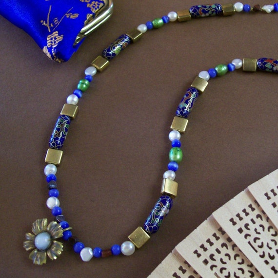
The first one, the necklace, could be interesting, and I still think it's a neat composition, but it's really flat. The reason? There's not enough contrast between the construction paper and the metals, so those fade out, and the glossiness of the silk coin purse matches the glossiness of the beads too well. The sandalwood fan, the construction paper and the metals dominate the image with their softer, earthy texture that is appealing but not flattering to this piece, while the shiny silk and the shiny cloisonne compete, dragging the eye in different directions at once. The white pearls then pop too much. They're nice color choices, but the texture is all wrong. I'm pretty sure that was the first jewelry photo I ever took.
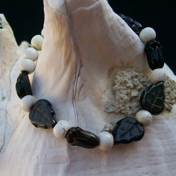
The bracelet draped on the shell was one of my very first good photos -- and, not coincidentally, my first actual Etsy sale. This one works because the color contrast is strong and the texture contrast is nicely layered: strong background to very soft shell to in-the-middle bracelet. The fade of the ivory silver desert sun beads (which apparently are made by firing a ceramic glaze over a sterling plate; pretty!) into the shell works because at the image's focal point, that rough grey debris forms a soft, but sufficient, color contrast and a much more marked texture contrast. The black glass stands out because it's so silky and smooth next to the shell.
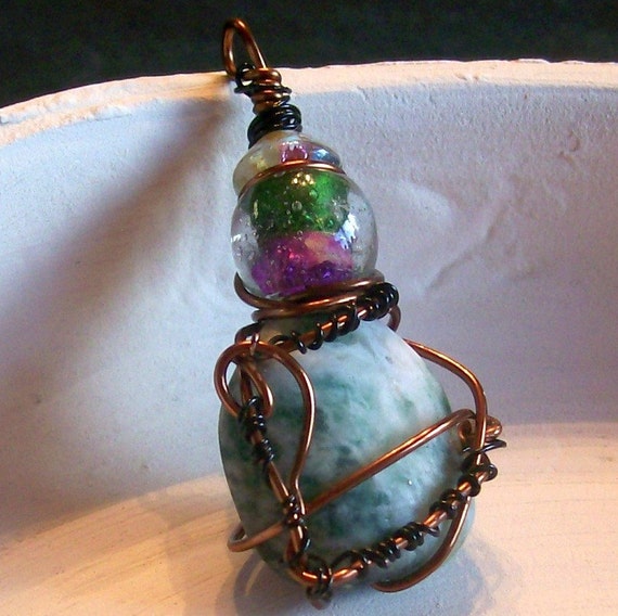
The pendant photo was after I switched to my pottery background but just doesn't work at all. Part of the appeal of the piece in person is the way the organic wirework (that's still my favorite piece of wire-wrapping I've ever done) complements in shape and contrasts in texture with the matte Ching Hai jade it's wound around; unfortunately, the jade and the rim of that broken pot? Exact same soft, earthy matte smoothness so you can't really see it. The gleaming, saturated glass color and smooth wire work okay, though. It might have worked if I'd laid the pendant in the concentric circles of soft grooves at the center of the dish.
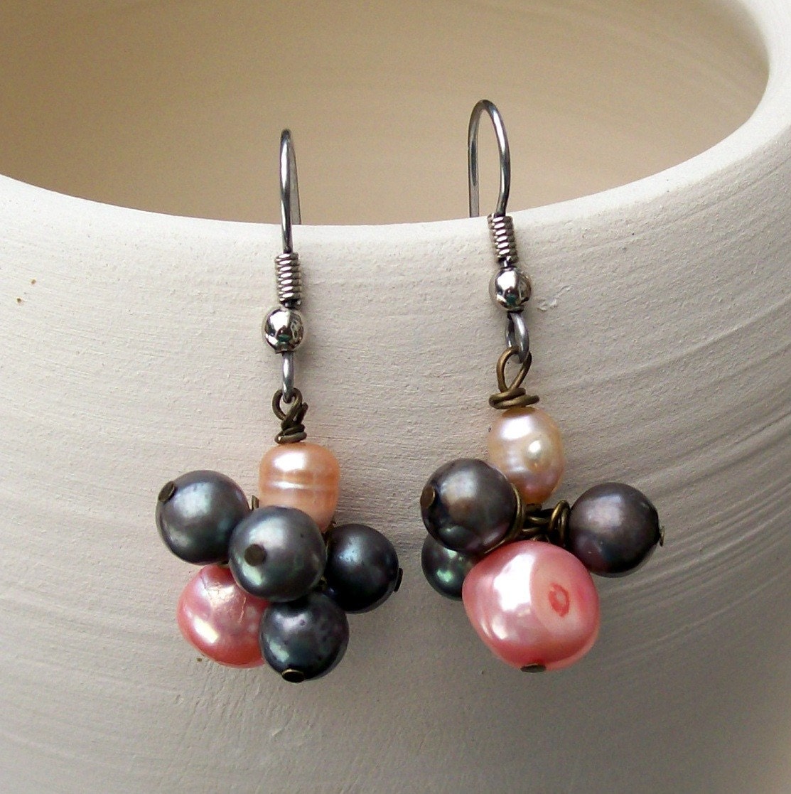
That last one of the earrings isn't bad. Now, I'd jack up the highlights a couple thousand times for more contrast, but the unique highlights of the pearls and their almost-smooth surface contrasts nicely with the soft brush lines in the pot, which also carry the eye back and forth between the earrings and causes their slightly different clusters to be perceived as a unit. That one works.
I still do staged style shots, but mostly for Flickr and the blog:

This one follows that same rule of layered textures, both in the jewelry itself and the photo composition -- from the concrete ground through the table to the piece itself, it's grainy, glossy-smooth, soft, grainy, glossy-smooth -- and it's one of those that I am really and truly happy with after almost no editing, which is rare enough to be noteworthy indeed.
I think that vine is the actual beaded piece on the left side ... though mostly by process of elimination ...
The cover shots are better now -- those seem to date from the early days (2005ish) when they clearly had no idea what they were doing -- and I call them out with all affection, because I love that magazine, but the insides are often no better what with the backgrounds being the same color or texture as the jewelry being photographed.
Which brings me, slowly, to my point: I think that texture difference is actually just as important as color difference in showing jewelry. Here are some of my earlier photos, in (as best I remember) the order I took them:
The first one, the necklace, could be interesting, and I still think it's a neat composition, but it's really flat. The reason? There's not enough contrast between the construction paper and the metals, so those fade out, and the glossiness of the silk coin purse matches the glossiness of the beads too well. The sandalwood fan, the construction paper and the metals dominate the image with their softer, earthy texture that is appealing but not flattering to this piece, while the shiny silk and the shiny cloisonne compete, dragging the eye in different directions at once. The white pearls then pop too much. They're nice color choices, but the texture is all wrong. I'm pretty sure that was the first jewelry photo I ever took.
The bracelet draped on the shell was one of my very first good photos -- and, not coincidentally, my first actual Etsy sale. This one works because the color contrast is strong and the texture contrast is nicely layered: strong background to very soft shell to in-the-middle bracelet. The fade of the ivory silver desert sun beads (which apparently are made by firing a ceramic glaze over a sterling plate; pretty!) into the shell works because at the image's focal point, that rough grey debris forms a soft, but sufficient, color contrast and a much more marked texture contrast. The black glass stands out because it's so silky and smooth next to the shell.
The pendant photo was after I switched to my pottery background but just doesn't work at all. Part of the appeal of the piece in person is the way the organic wirework (that's still my favorite piece of wire-wrapping I've ever done) complements in shape and contrasts in texture with the matte Ching Hai jade it's wound around; unfortunately, the jade and the rim of that broken pot? Exact same soft, earthy matte smoothness so you can't really see it. The gleaming, saturated glass color and smooth wire work okay, though. It might have worked if I'd laid the pendant in the concentric circles of soft grooves at the center of the dish.
That last one of the earrings isn't bad. Now, I'd jack up the highlights a couple thousand times for more contrast, but the unique highlights of the pearls and their almost-smooth surface contrasts nicely with the soft brush lines in the pot, which also carry the eye back and forth between the earrings and causes their slightly different clusters to be perceived as a unit. That one works.
I still do staged style shots, but mostly for Flickr and the blog:
This one follows that same rule of layered textures, both in the jewelry itself and the photo composition -- from the concrete ground through the table to the piece itself, it's grainy, glossy-smooth, soft, grainy, glossy-smooth -- and it's one of those that I am really and truly happy with after almost no editing, which is rare enough to be noteworthy indeed.
Wednesday, February 2, 2011
Neat shop concept
This shop is a newish Etsy venture with an awfully cool concept: Each pair of earrings is displayed on and named after a different kind of branch, from "Rose Hip Cascades" to "Pinon Shells" to "Salwag Seed Blossoms." Here are her "Turquoise Raindrops":
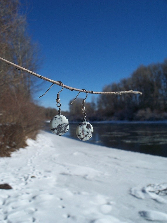
Image copyright Jessica Marks.
Just beautiful. I like it because it gives the shop a nice unified look without being all the same background. A lot of people on Etsy will pester one to use solid color backgrounds instead of themed ones like my broken pottery and raw silk and black jersey knit. What a neat way to blend background and "story" and personal appeal, though. Some of the photos in this shop are overexposed or just not quite sufficiently contrasty, but overall this is just lovely.
Subscribe to:
Posts (Atom)