Showing posts with label found objects. Show all posts

Saturday, October 29, 2011

Belatedly ...

... I really should mention that the Southern steampunk cons, Upstate Steampunk and AnachroCon, are well worth the trip.  I was a vendor at Upstate Steampunk at the beginning of the month.  It was a delight to meet so many fans of such vastly varying ages -- including many of my and M's colleagues, hers at Clemson and mine at the tech college!  This included Gypsey Teague, a lovely lady who makes killer chainmaille weaponry and who organizes the event with her partner.  Overall, the con was small but profitable and with superb gaming, and despite a giggling militant vegetarian who thought she was a pagan but didn't know what a solstice was at the next vendor table, I was delighted to meet a number of other vendors of clothing, jewelry, embroidery, fine art, etc. who were simply a pleasure.

I also had the great fortune of seeing some delightfully colorful steampunk outfits, including a young authoress who had assembled a brilliant bustled tatterpunk outfit in animal print.  It worked beautifully.

M and I did some fun multicultural stuff, including (for me) a Scottish-inspired pseudo-military ensemble with a vintage woman's kilt, a wool beret, and rendundant eyewear; and (for both of us) Anglicized/Orientalized North African outfits.  Me as warrior, M as harem girl.  She pulled it off with her usual aplomb.

Please, Southern steampunks: plan for AnachroCon in Atlanta at the end of winter and Upstate Steampunk next fall.  I can staunchly assure you that you won't regret it.


Available here.

Tuesday, September 13, 2011

It's my birthday and I'll talk about buttons if I want to

Yes, in fact it is.  My age is a palindrome for the first time in eleven years!  And until midnight M and I are only 8 years apart!

The buttons from the necklace I posted last week came from the single best deal I've ever gotten on vintage buttons.  Here's another made from buttons from the same lot:

 
Available here.

It was at a yard sale, and the guy selling them had sorted them into jars by color and clearly knew they were of value, but some jars had a horrifically foul-smelling mold in them, so he gave me a price cut on all of them if I was willing to clean them myself.  It turned out that only one jar had the mold, and the smell in the others was merely the natural consequence of putting lots and lots of Lucite in an airtight glass jar for a couple of months (Lucite stinks a little; it contains some kind of acid whose name escapes me at the moment).  I scrubbed them all with toothbrushes and buried them all in coffee grounds, and only ended up losing the one jar; the rest smell just fine, and there wasn't a single junk button.  All primo vintage stock.

Consequently, I can afford to do a special offer on stuff from that lot.  So here it is.  Buy two items, at least one containing buttons (look here), and get 20% off on the lower-priced item when you check out with the code "Lucite always kinda smells if you seal it in a glass jar for a month."  Spelling doesn't count.  Add the code to the Note to Seller when you buy and I'll give you the discount within 24 hours through PayPal.  Offer lasts until11:59 PM on September 30.

Tuesday, September 6, 2011

Instant Vintage


Available here.

What is it about this color combination that screams "vintage"?

I mean, naturally the color of the large plastic/resin buttons is very vintage -- I generally refer to that shade as "60's peachy pink," though from a quick consultation of that ever-handy resource, Wikipedia's list of colors by shade, I suppose technically it's coral.  (Random side note -- I'm that weird genetic anomaly, a colorblind female, so I can't actually distinguish a strong orange from a true red.  I have to ask M for a judgment of harmony if I'm designing in reds or greens, and it's made putting together the Mixed Media Packs for Ballet Llama something of an adventure.)

Anyway.  It's not the muted coral hue I'm referring to, but the combination of it with black.  Pink with black always looks either vintage awesome or modern tweeny "rock star" bleh to me, but this is a particular combination that M and some of my coworkers reacted to in the same manner.  Maybe it's the blue-black jet hue of the blacks that's doing it; that's also a very vintage-feeling color.

This, incidentally, is also one where I bit the bullet and included a photo on black, which may or may not have actually been a good idea:


But it looked too bizarre with black at the edges and white in the middle, and this gives a truer idea of the variation among the buttons, so this was the only way to make the contrast work.

In general, these aren't great photos. I'll need to rework the cropping, I think, and try for a deeper focus.

But hey, check out those great 1960s flapper-style rose beads!

Thursday, August 25, 2011

A Little Grin

In the description for the earrings below, I actually used the one really cool thing I learned from the Etsy writing workshop: Using a quick, unusual story to explain damage to a vintage item.


Sold!

To wit: "The two large pearl beads have slightly different shades and imperfections (I like to imagine it comes of their being worn by a dangerous gang of flapper girls for a famous faux pearl heist), but this is barely visible and what can be seen only enhances the vintage feel of the earrings."


It's always nice when something you wrote makes you smile a little later on.  I got this feeling from the descriptions of some of the stick incenses for my current Elance client, too.  It's a high, like suddenly realizing that the beads are falling into an additional pattern you didn't even plan but which is perfect.  Flipping over a pancake to find you've judged just right and it's wholly fluffy, and melt-in-your-mouth gold.  Or perfectly executing a martial arts form.

Tuesday, August 9, 2011

A necklace I wanted to talk a little more about


Available here.

I named this necklace Arc of Ages, which is supposed to be a cleverish allusion to Rock of Ages (still a'rollin, rock of ages ...).  We got the vintage (I date it to the 1970s based on style) necklace base from Grandma's Antiques and Things, a fantastic little store run out of a garage in Pendleton which has become my primary steampunkerie supplier (the octogenarian proprietor is really having trouble figuring out what those nice girls are doing with all that weird hardware).

What I wanted to point out, because my blog, not my item descriptions, is the place for annoying self-congratulation, is the rather coherent symbolism that forms in the strange combination of materials here.  (Note that M deserves the majority of the credit for this.)  The large watch face, of course, aligns it with the sf-clockwork look.  The rectangular shield has an odd, delightful filigree pattern reminiscent of a somewhat mechanized paisley -- and of course, nothing is more neo-historical than shamelessly appropriating the motifs of other cultures (see here.)  The arrangement of the subtle gears (really, they're barely visible in person, the light picking them up for an instant before they vanish for a moment in the harmonized chaos of the design) arcs gracefully around the watch face like an event horizon.  Also suggesting the passage of time and the "message of ancient days," as the sole quote I know from Cicero pontificates, is the centerpiece of the watch face: an antiqued silvertone pewter connector in the shape of a Celtic knot, representing infinity.

Multicultural, neo-Victorian, time-traveller-esque -- I think I found steampunk, honey!  Two different thicknesses of triple-link cable chain (vintage) complete the necklace in a statement-goddess-waterfall shape.

I'm also proud of the rather slick wirework on the piece.  See the back:

Tuesday, August 2, 2011

Business Chatter


Business-minded readers may wish to check out a recent Bullish column here: Doing Business with Friends and Still Having Friends (and a Business), by Jen Dziura.  You can find me "joining the discussion" (i.e., rambling to the faceless 'Net; that site doesn't have much comment activity and I was excessively lengthy) at the bottom of the article.

And check out some of the new jewelry items in the Steampunk Assemblage section of the shop.  Shown are a pendant, a necklace, and a brooch, ranging from clean utopian styles to gritty post-apocalyptic assemblages:

Friday, July 1, 2011

A glut of history lately? Now, necklaces!

I expect the two weeks of Oh Hai Super Intellectual are probably wearing on everyone by now, so a light post of pretty stuff today!

Observe the evolution of the steampunk button necklaces.  From this:


Available here, and okay, it's not actually steampunk.

To this:


Sold!

To this:


Available here.

I need to work on getting back to the relatively simple, found-object assemblage style in the middle of the process -- while I like the multi-buttons, especially with the very unified rope-and-flower motifs, I think the cleaner lines and simpler contrasts were a different look and got better reactions.

Friday, May 27, 2011

Home decor of nerdy glee

This warms the cockles of my heart and makes my hand twitch instinctively toward the Mod Podge:


Image courtesy Jennifer Ofenstein.

Isn't that incredibly cool?  I am thinking of perhaps a desk nook done in Victorian naturalist texts, damaged Audobon guides, cryptozoology sketches, with pressed leaves and flowers added for more color and texture.  It would be glorious.

The same person does awesome paper-piecing patterns: Here's a great little tutorial on using them for greeting cards.

Friday, May 13, 2011

Mixed media, Fiber jewelry, Strawberries, M


Image copyright Fanciful Devices.

These are awesome and cool and make me want to do a lot more fiber.

They initially appealed because M loves strawberry stuff, but I'm not sufficiently ironic and hip to not cringe at the little Indian (the artist is Uruguayan, and doesn't have my guilt issues on the subject).  Then I became enchanted by the use of the appliques.  Maybe they could be ironed onto fabric and cut out?

By the way, I bought some awesome enameled bells for M from this seller; impressively swift shipping!  I got some chihuahua bells and some strawberry ones, which were sold with this lovely lovely style shot:

The transition there was strawberries.  Yeah.  Now hold onto your powdered wigs, ladies and gents, I'm making a sharp U-turn back to fiber.

I have some cabochons which are clear acrylic and magnify what's underneath, and I'm considering going through M's and my (mostly her) quilting fabric stash for small patterns that would look nice under a fisheye magnification.  I think this might be a nice, easy, lower-priced assembly project, maybe with a little beading -- I really am starting to work at a level I need to charge higher prices for, so it would be good to have a lower-end point-of-sale or niece-gift product which doesn't scream, "I'm reselling pot metal shaped by small children in Malaysia or Hong Kong!"  (Actually, Hong Kong is supposed to be tightening up regulations, last I heard.  Snaps for Hong Kong if this is the case.)

Fiber.  Strawberries.

I used hemp and polyester ribbon in this one:

Available here.

TERRIBLE light.  Dear God, I need to retake those.
Yeah, this post is not remotely topical.

Wednesday, May 4, 2011

Friday, April 29, 2011

Jewelry Sets and Busy-ness

I've become a lot bolder about listing coordinating items separately of late.  My bridal jewelry all links to the rest of the collection in the listing, since those are intended to be sort of infinitely mix-and-match.  Lately, I also listed this set:


Available here and here. Sold!

That ... is a weird piece.  I have to say it.  It's really odd.  Even more disparate materials than I usually combine, which, with me, is saying something.  It would be awesome to layer with a longer piece, though, a pendant on a very long cord maybe?  I haven't done a lot of A.) chokers or B.) multistrand before, though I've done a good few of the latter lately.

And I'm fond of the earring photo; I think I managed the depth of field and dimensionality, what with turning the pot that the earrings hang in toward the light and away from the camera, which makes them a little more interesting.  Not sure it's visible at the teaser size, though.  Hmm.

Also, since I originally wrote this post, the set has sold.  Obviously I'm not the only one who likes it!

I always consider jewelry sets to be an excellent gift -- coordinating necklace-earrings, bracelet-pendant, pendant-earrings-bracelet or what-have-you vastly increases the perceived value.  However, I'm getting more confident about breaking up jewelry sets listing-wise because I often sell them that way in person, with someone wanting just the necklace but not having pierced ears, preferring studs, or not caring for the pendant but liking the color combination and so purchasing the matching bracelet alone.  Things like that.  It's only twenty cents more for me, and it takes my customers to the Priority-shipping upgrade faster, so I think this is actually better.  Thoughts from the reader pool?

On another note, we've just finished out the semester at the tech college, and in the sudden glut of free time and M-is-home time I've had a couple of stupidly productive days.  We're still decorating the house, the garden flourishes, and I made hamburgers with homegrown spinach on them last night.  The Japanese maple looks like the Japanese maple.  The English primrose and daisies are not terribly happy, which is not unexpected, but my Oscar milkweed, liatris, and (shockingly) trout lilies are all remarkably happy.  The Jack-in-the-pulpit died but it's been the only thing to croak out of season so far.  More topically, I've made approximately a thousand charm bracelets, two with bits of miniature tea set and three with buttons, including my weird but somehow trademark combination of plastic buttons with pearls. We're discussing having all our work friends over for traditional British tea and jewelry-showing sometime next month. 

For those interested, I'm selling off much of my collection of vintage hematite in the Ballet Llama storefront.  There are also some nice hard-to-find charms there.  Get 'em while the getting's good!

It's hot, but life is nice right now.

Friday, March 11, 2011

Mixed Media and Urban Decay

Just wanted to share about a picture from one of my favorite fellow sellers, Fanciful Devices:


Photo copyright Fanciful Devices.

That's a filigree that she's glued paper to -- apparently at the expense of her floor -- she says it was quite stiff.  But I wonder, if one papier-mached and then top-sealed newspaper instead of standard print ... possibly over one of those wire frames which one has ruined in plier overenthusiasm but has not the heart to be rid of ...

I also love how that artist uses cameos: infrequently, but without feeling bound to make them girly when she does.

Further eye candy of urban decay and material culture: We Sell Used Gods.  Further further eye candy of urban decay and material culture: 99 Rooms. 

Have some time, and maybe some earbuds, handy before you click that latter.  You'll want them.  It's insanely cool and deserves half an hour of your full attention.

(oh crap I just realized I left the bread dough on the counter overnight and now I'm at work and I can't save it.  I guess that's one way to use up whole wheat flour that doesn't quite work in the recipe ...)

Wednesday, February 9, 2011

The Buttons of Arizona


On the drive home, we stopped for gas in Quartzsite, Arizona -- a bizarre little town where you can't see the town, only the business loop where evidently the owners of the shops and gas stations sleep under the counters -- and in a strange little Quonset-hut store, we bought a bunch of cool vintage buttons.

Some of them are here.  A few seem to have been (rather ineptly) made into jewelry components at one point; many will suit very well for those vaguely-steampunk found object necklaces I've been doing lately.

The big hibiscus flower in the middle is a good example of why I try to avoid metallized plastic, but the wear and tear on the button has given it an awesome weird patina -- the orange is under the silver -- I'm tempted to do a tongue-in-cheek vintage-Aloha-shirt bracelet with it.  It's quite large; for scale, that orange enamel waffle-weave button on the lower left is a bit bigger than a nickel.  The one on the far right appears to be hemp fiber or burlap in a metal frame, which would be cool for a softer mixed-media piece.

The items focused on in the top photo are some little things purchased from the same weird, shivery shop: elderly bolts, it seems, which may have been buried or left in water.  They have a nice pale, grainy bone look, which I expect will be awesome for a steampunk assemblage piece; I'm hoping I can ream the longer ones to restore the holes through the center, but the Phillip's-head still has a clear hole and is a sure bet for being awesome in ... something!

This also functioned as an experiment; that's the same place I'll be taking my shop photos from now on, though on the jersey knit rather than right on our little glass-topped table.  The lighting is a touch cold, but warming photos isn't hard.  We've actually discussed painting a water-colored Tiffany streak on the underside of the glass to go with our aqua pots and green and purple flowers, which could conceivably make a superb stage for style shots, but ... we'll see!

Friday, February 4, 2011

Texture in jewelry photography

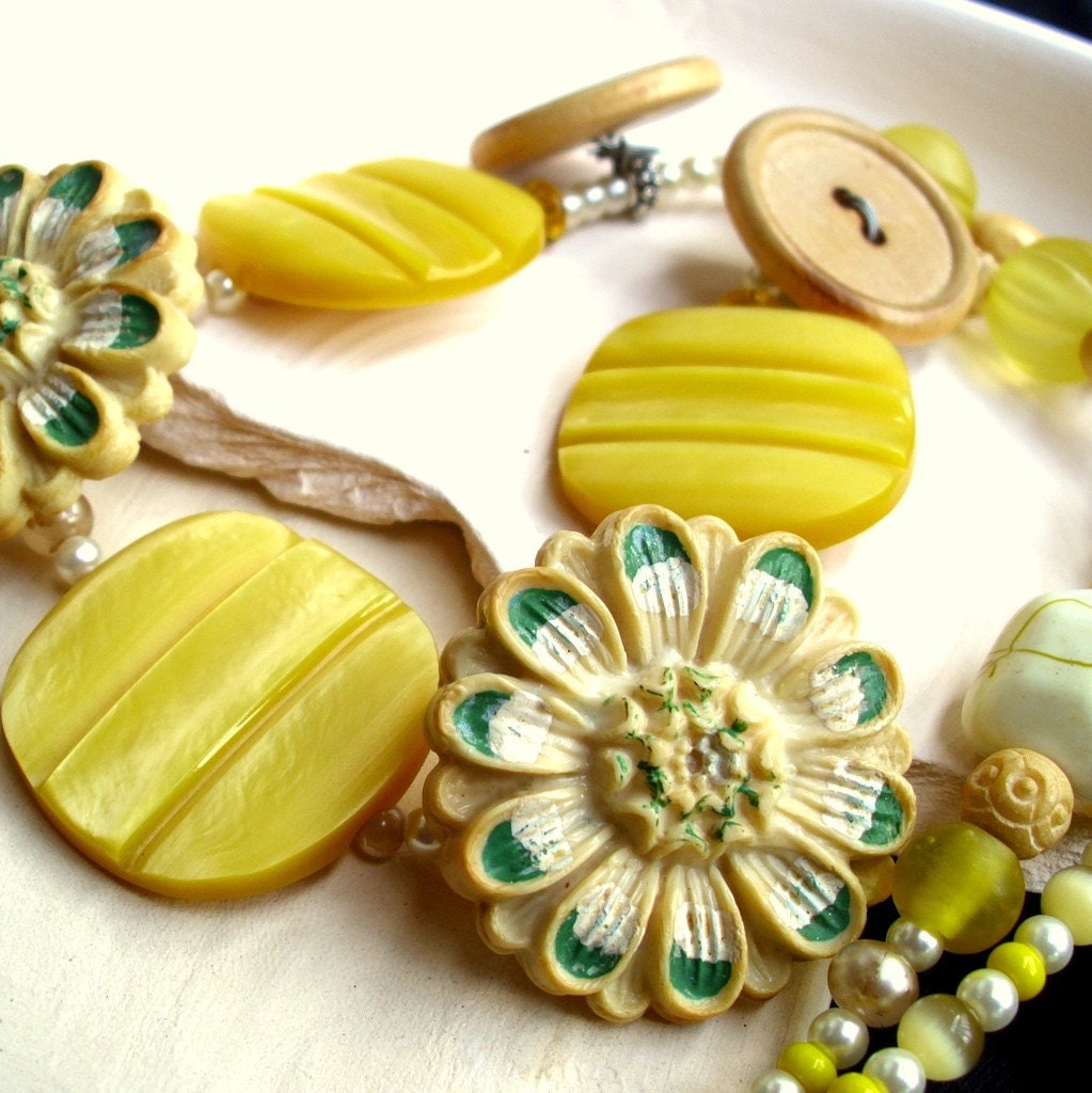
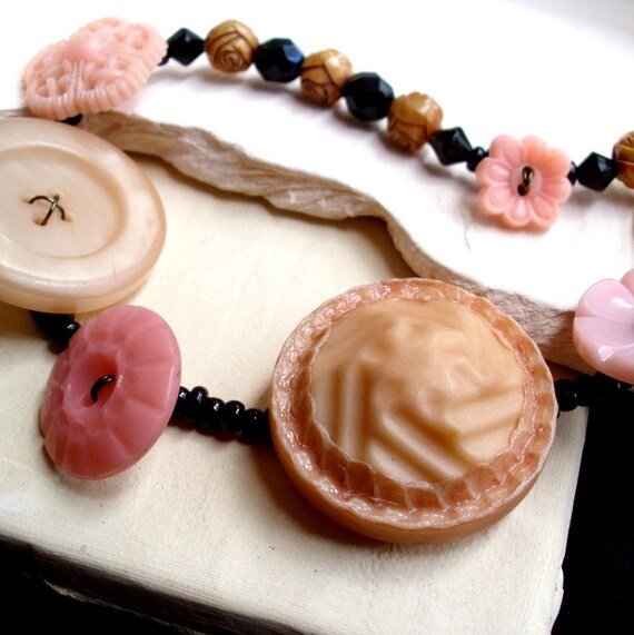
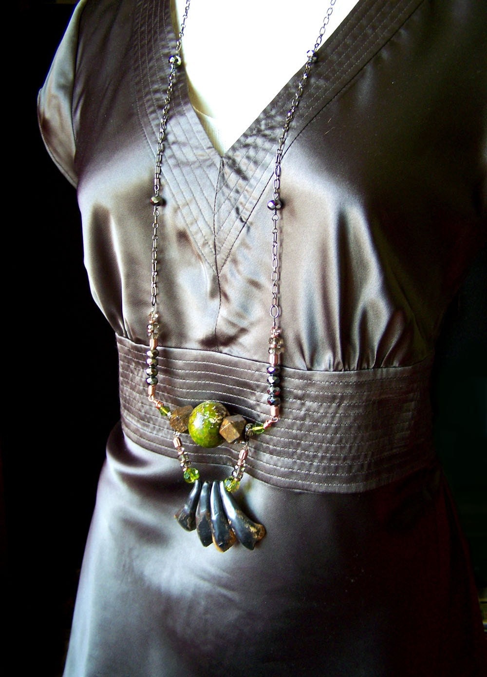
Staged photos (style shots; the opposite, with item alone, is called a hero shot) in newer shops are often something of an object lesson in contrast. Which is not the owners' fault. Considering.  Have a look at these covers from Bead Unique magazine for the example new jewelry businesses have to follow:


I 
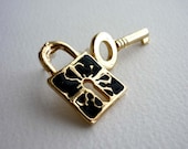
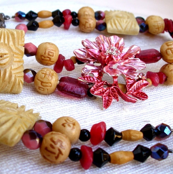
think that vine is the actual beaded piece on the left side ... though mostly by process of elimination ...

The cover shots are better now -- those seem to date from the early days (2005ish) when they clearly had no idea what they were doing -- and I call them out with all affection, because I love that magazine, but the insides are often no better what with the backgrounds being the same color or texture as the jewelry being photographed.

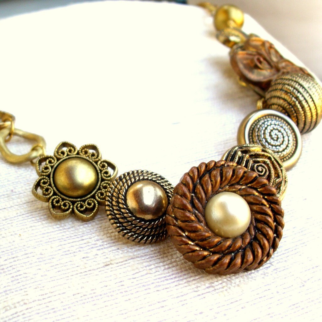
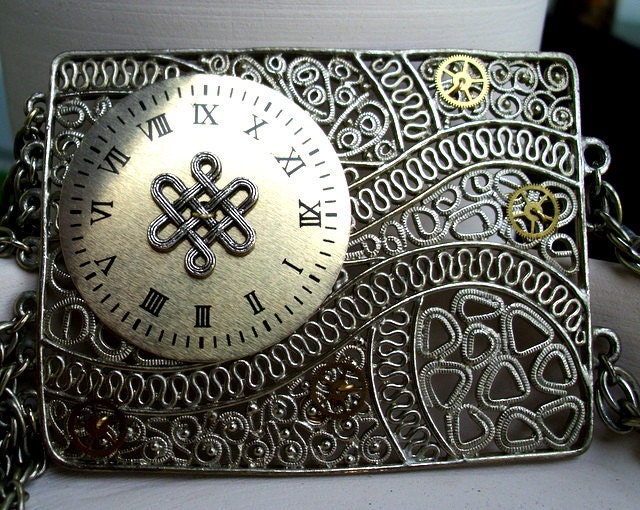
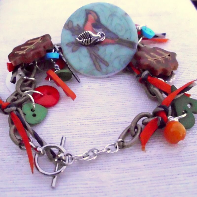
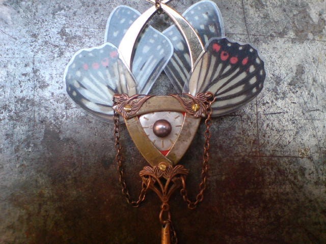
Which brings me, slowly, to my point: I think that texture difference is actually just as important as color difference in showing jewelry.  Here are some of my earlier photos, in (as best I remember) the order I took them:


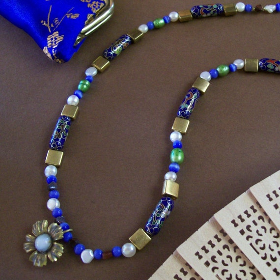
The first one, the necklace, could be interesting, and I still think it's a neat composition, but it's really flat. The reason? There's not enough contrast between the construction paper and the metals, so those fade out, and the glossiness of the silk coin purse matches the glossiness of the beads too well. The sandalwood fan, the construction paper and the metals dominate the image with their softer, earthy texture that is appealing but not flattering to this piece, while the shiny silk and the shiny cloisonne compete, dragging the eye in different directions at once.  The white pearls then pop too much.  They're nice color choices, but the texture is all wrong.  I'm pretty sure that was the first jewelry photo I ever took.

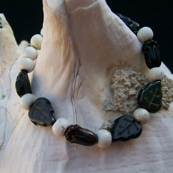
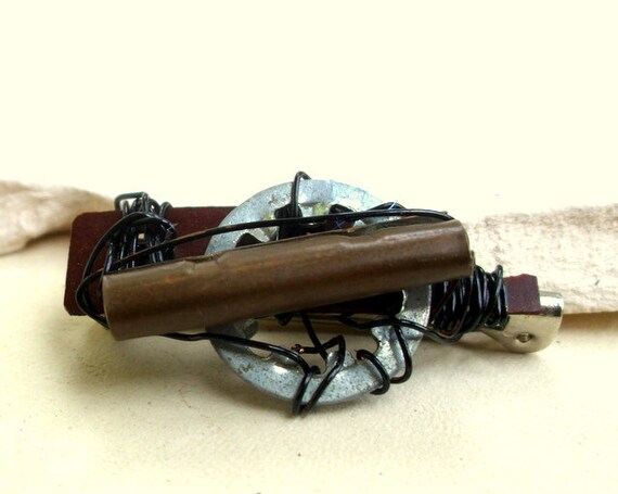
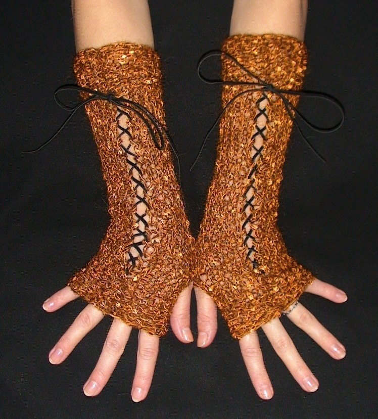
The bracelet draped on the shell was one of my very first good photos -- and, not coincidentally, my first actual Etsy sale.  This one works because the color contrast is strong and the texture contrast is nicely layered: strong background to very soft shell to in-the-middle bracelet. The fade of the ivory silver desert sun beads (which apparently are made by firing a ceramic glaze over a sterling plate; pretty!) into the shell works because at the image's focal point, that rough grey debris forms a soft, but sufficient, color contrast and a much more marked texture contrast.  The black glass stands out because it's so silky and smooth next to the shell.

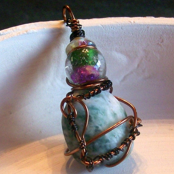
The pendant photo was after I switched to my pottery background but just doesn't work at all.  Part of the appeal of the piece in person is the way the organic wirework (that's still my favorite piece of wire-wrapping I've ever done) complements in shape and contrasts in texture with the matte Ching Hai jade it's wound around; unfortunately, the jade and the rim of that broken pot?  Exact same soft, earthy matte smoothness so you can't really see it.  The gleaming, saturated glass color and smooth wire work okay, though.  It might have worked if I'd laid the pendant in the concentric circles of soft grooves at the center of the dish.

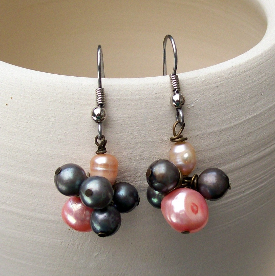
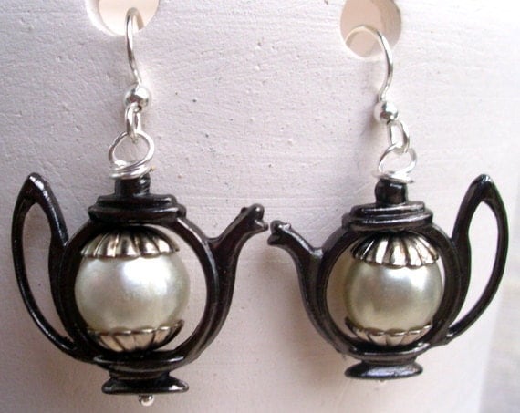
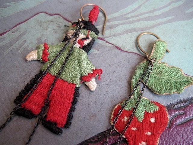
That last one of the earrings isn't bad.  Now, I'd jack up the highlights a couple thousand times for more contrast, but the unique highlights of the pearls and their almost-smooth surface contrasts nicely with the soft brush lines in the pot, which also carry the eye back and forth between the earrings and causes their slightly different clusters to be perceived as a unit.  That one works.

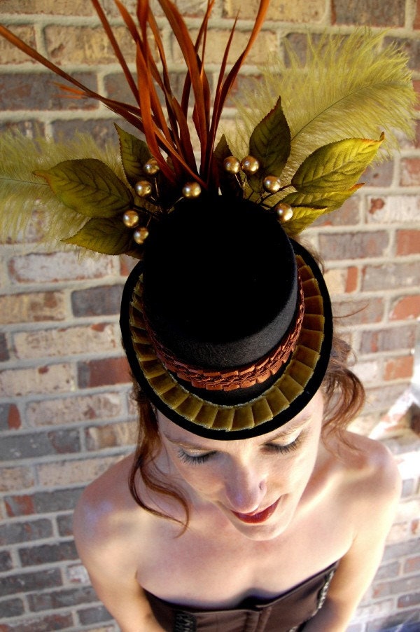
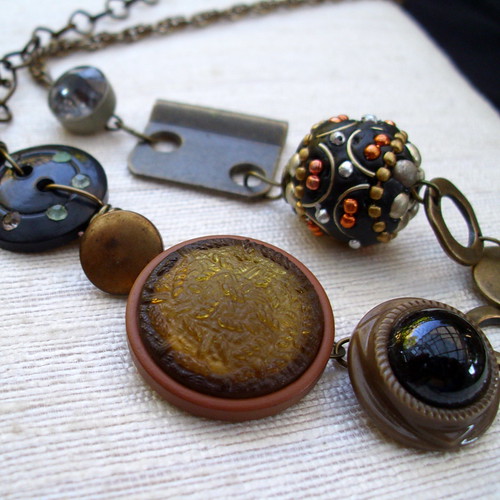
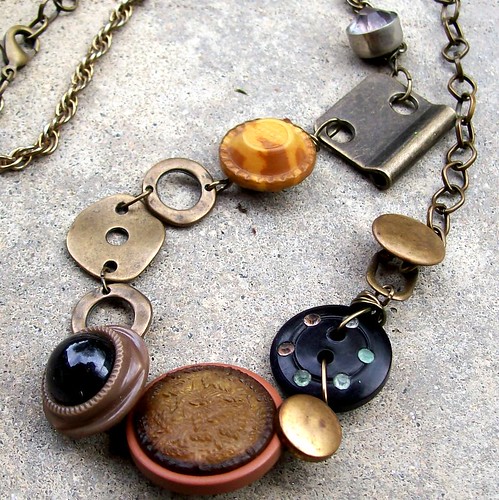
I still do staged style shots, but mostly for Flickr and the blog:

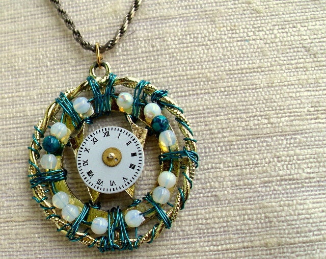
This one follows that same rule of layered textures, both in the jewelry itself and the photo composition -- from the concrete ground through the table to the piece itself, it's grainy, glossy-smooth, soft, grainy, glossy-smooth -- and it's one of those that I am really and truly happy with after almost no editing, which is rare enough to be noteworthy indeed.

Monday, January 31, 2011

If I had a couple of hundred bucks to spare ...

This artist is doing some really amazing things with the steampunked-out technology.  His USB drives incorporate small cabochons over the LED light so that the gemstone glows when the drive is in use.  They're not overdone or gear-conglomerated -- just wonderfully graceful, masculine tribal steampunk designs with beautiful metal tones.  Check him out.


Image copyright Weirdward Works.

Speaking of steampunk and things I'd like to buy (and indulge me, dear sirs and dear ladies, by allowing me to draw your attention to that so-graceful transition there), I'm currently trying to come up with a way to sort my lock washers and hinge plates and eyelets and keys and suchlike junk.  (It's really sublime junk.  I don't mean to denigrate its awesomeness by calling it junk.  Scrap metal!)  I really need a happy medium between "dump it in a basket," which is my pendants-and-components solution, and "sort it into a carefully labeled divider box," which is my (M's) bead solution.  Of course, M uses this stuff too, so the latter is probably what is required because she doesn't need the creative chaos I do.  Still.  I like to physically rummage for such things.  Though I also like to know how many of anything I have.  Sigh.

Monday, December 27, 2010

Custom order hinge plate necklace

The first version:


And the second:


The only major change is that the embellished clay bead from version one was replaced with the cool mustardy button in version two. It lies better and I think the one pop of bright yellow-gold balances nicely with the two more mellow brushed golds on the other side. I'm especially happy with how subtly the metal tones of the findings (new) and the chains (one new, one vintage) complement one another. It's also really long, which is different for me -- 28 inches and adjustable down. So it's now off to Australia. Great fun!

Monday, November 29, 2010

If I were a rich man ...

... I would use a lot more of the following.

1.  Cloisonne.  I love cloisonne.  I've recently discovered that this is a passion I share with my maternal grandfather.

Available here.

2.  Ruby.  I've discovered how much I adore this stone.  It can be purply or deep true blood red or pink and has the whole range of opacity.

Available here.

3.  24k gold.  I love to use copper and brass in my jewelry, but I'd love to occasionally use real gold just because it's so hard to find in unique handcrafted pieces, being much more common in traditional fine-jewelry designs.

Available here.

4.  Vintage buttons.  They're so beautiful ... and often so pricey.


Available here.

This, of course, is the nice thing about custom orders; I know the initial outlay for such fine materials will pay off.  Which is so nice.  *sighs wistfully*