
I think that vine is the actual beaded piece on the left side ... though mostly by process of elimination ...
The cover shots are better now -- those seem to date from the early days (2005ish) when they clearly had no idea what they were doing -- and I call them out with all affection, because I love that magazine, but the insides are often no better what with the backgrounds being the same color or texture as the jewelry being photographed.
Which brings me, slowly, to my point: I think that texture difference is actually just as important as color difference in showing jewelry. Here are some of my earlier photos, in (as best I remember) the order I took them:


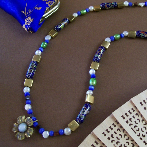
The first one, the necklace, could be interesting, and I still think it's a neat composition, but it's really flat. The reason? There's not enough contrast between the construction paper and the metals, so those fade out, and the glossiness of the silk coin purse matches the glossiness of the beads too well. The sandalwood fan, the construction paper and the metals dominate the image with their softer, earthy texture that is appealing but not flattering to this piece, while the shiny silk and the shiny cloisonne compete, dragging the eye in different directions at once. The white pearls then pop too much. They're nice color choices, but the texture is all wrong. I'm pretty sure that was the first jewelry photo I ever took.
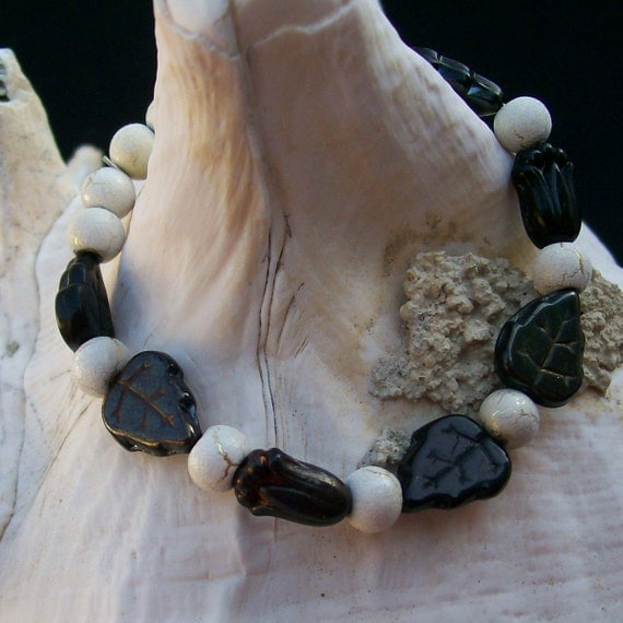
The bracelet draped on the shell was one of my very first good photos -- and, not coincidentally, my first actual Etsy sale. This one works because the color contrast is strong and the texture contrast is nicely layered: strong background to very soft shell to in-the-middle bracelet. The fade of the ivory silver desert sun beads (which apparently are made by firing a ceramic glaze over a sterling plate; pretty!) into the shell works because at the image's focal point, that rough grey debris forms a soft, but sufficient, color contrast and a much more marked texture contrast. The black glass stands out because it's so silky and smooth next to the shell.
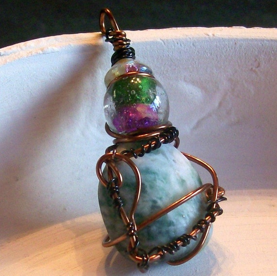
The pendant photo was after I switched to my pottery background but just doesn't work at all. Part of the appeal of the piece in person is the way the organic wirework (that's still my favorite piece of wire-wrapping I've ever done) complements in shape and contrasts in texture with the matte Ching Hai jade it's wound around; unfortunately, the jade and the rim of that broken pot? Exact same soft, earthy matte smoothness so you can't really see it. The gleaming, saturated glass color and smooth wire work okay, though. It might have worked if I'd laid the pendant in the concentric circles of soft grooves at the center of the dish.
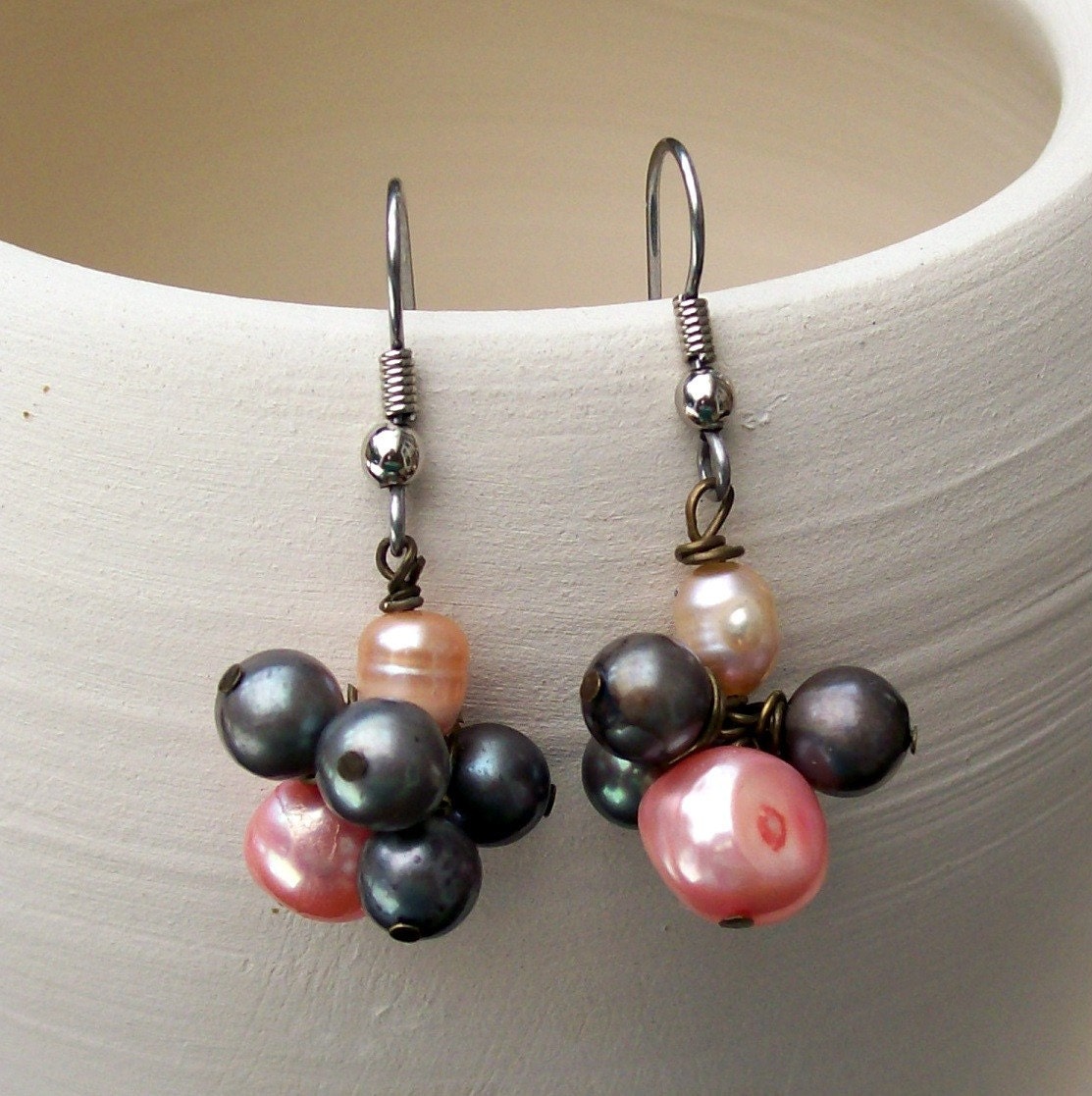
That last one of the earrings isn't bad. Now, I'd jack up the highlights a couple thousand times for more contrast, but the unique highlights of the pearls and their almost-smooth surface contrasts nicely with the soft brush lines in the pot, which also carry the eye back and forth between the earrings and causes their slightly different clusters to be perceived as a unit. That one works.
I still do staged style shots, but mostly for Flickr and the blog:

This one follows that same rule of layered textures, both in the jewelry itself and the photo composition -- from the concrete ground through the table to the piece itself, it's grainy, glossy-smooth, soft, grainy, glossy-smooth -- and it's one of those that I am really and truly happy with after almost no editing, which is rare enough to be noteworthy indeed.
No comments:
Post a Comment