Available here.
What is it about this color combination that screams "vintage"?
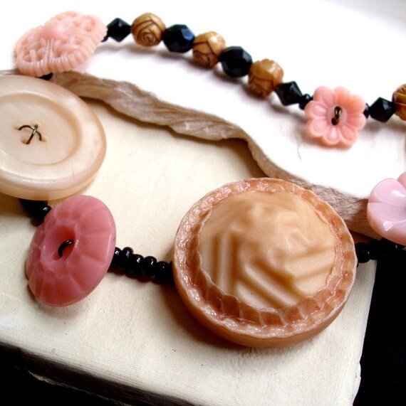
I mean, naturally the color of the large plastic/resin buttons is very vintage -- I generally refer to that shade as "60's peachy pink," though from a quick consultation of that ever-handy resource, Wikipedia's list of colors by shade, I suppose technically it's coral. (Random side note -- I'm that weird genetic anomaly, a colorblind female, so I can't actually distinguish a strong orange from a true red. I have to ask M for a judgment of harmony if I'm designing in reds or greens, and it's made putting together the Mixed Media Packs for Ballet Llama something of an adventure.)
Anyway. It's not the muted coral hue I'm referring to, but the combination of it with black. Pink with black always looks either vintage awesome or modern tweeny "rock star" bleh to me, but this is a particular combination that M and some of my coworkers reacted to in the same manner. Maybe it's the blue-black jet hue of the blacks that's doing it; that's also a very vintage-feeling color.
This, incidentally, is also one where I bit the bullet and included a photo on black, which may or may not have actually been a good idea:
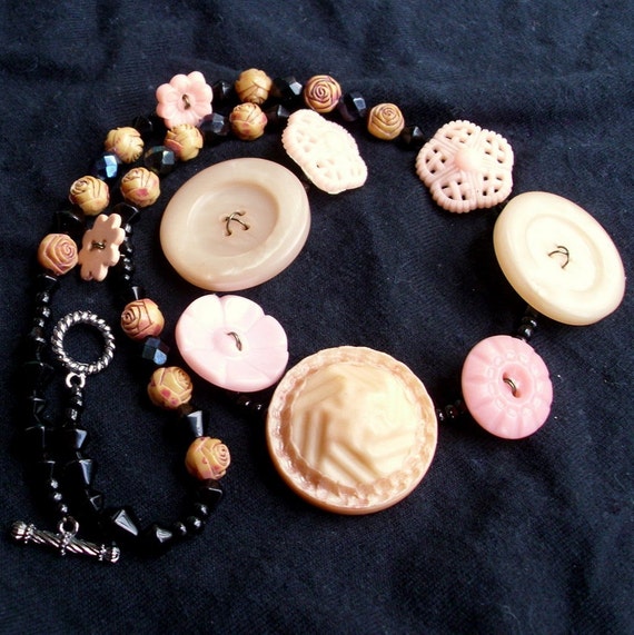
But it looked too bizarre with black at the edges and white in the middle, and this gives a truer idea of the variation among the buttons, so this was the only way to make the contrast work.
In general, these aren't great photos. I'll need to rework the cropping, I think, and try for a deeper focus.
But hey, check out those great 1960s flapper-style rose beads!
No comments:
Post a Comment